Friday, August 18, 2006

Little Icon, Acrylic on paper and board,65 x 52cm

"Little Icon" is another piece in the acrylic series. Lots of texture with a painting of a "perfume" bottle painted in a realistic manner. I have really enjoyed these paintings, mainly because I am not sure of the outcome or the reaction (worry, worry!). I am in the middle of putting together the catalogue for my show in the Open Eye Gallery, Edinburgh and the new pieces will be represented by the "Key to Africa". Here is a detail of the "Little Icon".

"Little Icon " Detail

Friday, August 11, 2006

New painting!

Key to Africa, Acrylic on paper and board, 2006


I have been working extensively with watercolour for about five years now. Fairly recently I was asked to produce some pieces for my show in the Open Eye Gallery which could go in their windows. Not wanting to put watercolours under strong light I decided to do a few acrylic. This prompted me to think again about process and subject matter and how I could utilize the benefits afforded to me through using this durable medium.

The results have so far been pretty interesting, although how they will sit with the rest of my show I am not sure. How the Gallery and buyers view these pieces will also be very interesting.

Here is the first piece now completed. The key in the centre is an item bartered for in the souks of Marrakech. If you like let me know what you think.

Friday, August 04, 2006

" The Dakak - the one who knocks", Watercolour on paper

I collect and purchase as many objects as I can when I am on my travels. These are then worked into still life's and can add a touch of authenticity and inspiration when developing my ideas.

I was in Morocco during Ramadan and having never observed this before, read a little about it.

I came across the book 'Behind Moroccan Walls' by Henrietta Celarie (first published 1931), and came across this description.

"At Fez the believer charged with waking the woman is called the Dakak". "one who Knocks". "The position of Dakak is hereditary", "He receives a small sum as remuneration from the Habous and each inhabitant contributes toward paying the dakak of his quarter by handing over fifty centimes with seventeen measures of wheat"

Friday, July 28, 2006

Just finished

"The Taleb's jinn", Watercolour on paper


This painting was completed yesterday and represents a wee bit of a struggle, but I think it was ultimately worth it.
A Taleb is a student of the magic arts. "Moroccans seem very suggestible to occult practices, genies and the like." 'The plurals "jinn"'. They're taken seriously:even intellectuals look over their shoulders in case a genie is following.
(taken from- "The city in the 1960s" by Anthony Gladstone-Thompson)
The lamp is a contemporary creation, but I like the juxtaposition of the modern object with ancient symbolism.

Thursday, July 20, 2006

Blast from the Past

"All things are numbers", watercolour on paper


I decided that I will occassionally show you some of my past work. Sometimes my painting has sold before anyone has had a chance to see it. Although the primary aim is to sell, it is always nice to be able to share your vision and hard work with others.The photograph below (sorry about the apendage(me) next to it, but it gives you a nice sense of scale) was the last time the painting was viewed in public.

RSA, Edinburgh -"If I could go anywhere", 15 years of the Alastair Salvesen award

Prints

"Synthesis", original -watercolour on paper

I have just received a copy of a couple of Giclee prints in the post today which can be purchased directly through the printers at http://www.macdonaldfineart.co.uk/index.php

The image quality is excellent and I thoroughly recommend them if you collect Giclees. Originals are obviously infinitely more desirable but if the painting has already been sold, then this is an excellent way to still have the image at an affordable price.


"Industrial Growth", original - Watercolour on paper

Monday, July 17, 2006

Morocco: windows

"3 cobalt windows", Marakech, watercolour on Paper

I am having an exhibition of work in the Open eye Gallery, Edinburgh, Scotland in September 2007.

The theme of the show is Morocco and I have tentatively called the exhibition Morocco: Windows, carpets and Orange boxes. I shall, over the course of the next few months, post a few teasers of pieces which will be considered for the exhibition.

I am to have a catalogue produced and therefore will have to create a lot of my work a good couple of months in advance of the exhibition. Nothing like a bit of pressure to focus the mind.

The "3 cobalt Windows" is an amalgamation of 2 viewpoints. One contains the window and another is a view from the El Badi palace ruins. Its really a painting of an imagined situation in Marakech. Something that I do all too frequently. The trick is to make it look convincing.

Tuesday, July 11, 2006

How did you paint that?

Lily Shadows, watercolour on paper


“Lily Shadows”

The still life was lit by one of a series of small spot lights I have wired to the roof of the studio- by playing around with the spots left and right I was able to come up with an interesting composition where objects dissolve and emerge from the shadows.
Shadows and lighting are extremely important to me and I spent a great deal of time with the lighting getting exactly the right sort of conditions to produce an interesting picture.

The colour philosophy for this picture was to create a particular orange/green balance around the painting with the blacks (produced by mixing Prussian blue and sepia) acting as anchors, punctuation and full stops. The light flickers through the leaves with a gentle warm glow.

I begin each picture with a clear idea about composition and then set about creating a fairly precise pencil drawing using a 2B-4B, being careful not to press too heavily on to the paper. Once I have the drawing done (sometimes that can take a couple of days in itself), I begin with the palest washes, often limiting the colour to a very small range and working with pure colour (unmixed).The only colour I mix constantly would be my black (blue & brown).
I proceed to build the picture through layers of pure colour anticipating results (laying blue over yellow –green), effectively mixing on to the paper with a series of glazed layers.

I work with the colours watered down to begin with and proceed to thicken the mix as the painting progresses. I make sure once a layer goes down, never to go over it again until its dry (even if I make a mistake) as this will result in a bare patch forming (the more you agitate the surface the more you lift out not put on)
I am constantly assessing what the picture needs and I never get into being too specific too quickly. Let all areas progress at the same time (I change this axiom when I am doing a complex painting involving different techniques in different areas, -i.e., texture in one part, smooth wash in another). I may introduce colour pencil at some stage if I feel it is needed and not every picture needs it. In this instance it helped with adding slight orange to shadows and producing smooth transitions from one part of the wall (top) to another. It is sometimes useful if you have overstepped the tone of a particular part to work back over with a slightly paler pencil. I then proceed to eventually work into areas with detail, tidying up edges, picking out highlights with Chinese white (not a purist I’m afraid) and viewing the picture from a distance to see if it is reading as a whole and not as a jumble of parts with equal focal points jousting for attention.

The picture has a lot of different techniques working together as a unit – I don’t like it to be very obvious how each part was created. If I become too aware of a particular technique then it has been “over cooked”. There are a lot of flat washes and a number of wet on wet areas – particularly at the start. Once I have achieved what I need from the wet on wet (the back wall was originally created this way) I then prefer to work wet on dry. I always try to reserve my whites by using masking fluid and the ball and certain parts of the flowers were kept this way. I will use Chinese white if I need to but find that it can be quite cold compared to the white of the paper. There is a little bit of spraying with an airbrush to soften the shadows- again I use this tool in certain circumstances and not in every picture.
My motto is use whatever works as long as it is conservation friendly, i.e. I don’t want bits falling off the picture next week!

The main challenge with this picture was to get the punchy quality produced from the shadows without the shadows becoming an overwhelming part of the picture – I needed them (shadows) to sit quietly in the background, not competing with the main object of focus (flowers).

How did you paint that? 100 ways to paint still life and florals.
ISBN 1-929834-39-X
Published by International artist


Friday, July 07, 2006

Illusionism


Angus McEwan RSW
“Art and Artifice”

Watercolour, acrylic and watercolour pencil
on Fabriano not 300gsm watercolour paper

This painting can be loosely described as having connections to the form of painting called “Trompe l’oeil”, which is French for deceiving the eye.

The painting is part of a door taken from the fish market in Venice, Italy. The door has a window which has rusted iron slats across it. The door is rather roughly put together and has been painted green at one stage, but is now looking worse for wear with the passage of time.


Below the window is a note attached to the door. On the note is a drawing of a flower and although monochromatic has fooled a bee into taking a closer look.

This directly relates to a story told by “Pliny the Elder in the ‘History of Nature’, where the ancient painter Zeuxis is praised for painting such realistic grapes that birds would come along and pick at them, mistaking them for the genuine fruit.”

Woven subtly in amongst the piece of white paper is a hint of a map of Venice, thus placing the door geographically.

Illusionism and deception is what this painting is about, thus the title, “Art & Artifice”.

Angus McEwan RSW

Monday, July 03, 2006

More Publications

"Eye of Flora", Watercolour on paper


How did you paint that? 100 ways to paint flowers and gardens.

Inspiration
The reason for painting any picture can be rather difficult to explain, the best solution I have found is to allow my gut feelings to take a part in the decision making process. Most often than nought it has more to do with how something looks, rather than the subject matter itself. In this instance I enjoyed the play of light falling across the dried and fragile flowers. The depth of tone and colour drew me to the subject, the chiaroscuro, intrigued me and the challenge held me there. I rather enjoyed the way the darkness dissolved some of the objects, and I often look for this aspect when choosing a subject to paint.

Symbolism
I quite like the idea of a window, within a window, within a window (the painting of course in the traditional sense could be seen as a window into another world). If the eye is known to be the “Window of the Soul”, the window is thus known as the “Eye of the Soul”, symbolic of consciousness and of the individual’s perception of the world. Flora was the goddess of spring, the vine, fruit, flowers and grain, symbolizing fertility. Thus the title, the “Eye of Flora”.


Composition

We are looking at a vase of flowers sitting on a window (almost in the centre of the painting); on the left hand side there is another window which is flooded with light. Between the two windows, there is a corridor.

There are a few objects sitting on the window sill which, I decided, would become simplified shapes hidden in amongst the shadows – suggestions are so much more powerful than statements.

The focal point is obviously in the centre of the picture and is of course the busiest in terms of detail, tonal contrast and colour range.

"How did you paint that?" 100 ways to paint Flowers and Gardens

ISBN (1-929834-44-6)

Friday, June 30, 2006

How did you Paint that?

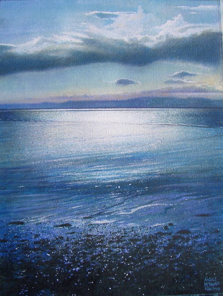
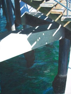
Under the Boardwalk -Santa Monica, CA, watercolour on paper, 84 x 66cm


"100 ways to paint;
Seascapes, Rivers & lakes".
This publication was produced by International artist and it presents 100 different artist's work and the method s they used to create their masterpieces. My painting "Under the Boardwalk" was reproduced as Artist 51(not unlike area 51 - a complete mystery). Here is a small note on the inspiration behind this piece.
Main Challenge – Light
The quality of light I enjoy in Scotland tends to be of a particular steely blue character and when I go abroad the sunlight has a stronger warmer, yellow quality that really intrigues me. Of course it’s not only the sunlight that interests me; it’s the quality of deep intense blue shadows that usually catches my eye.

My parents live in Los Angeles and I visit on a yearly basis, occasionally doing a little painting, but most often than not observing. I take pleasure in the quality of light, the Spanish style architecture and the over all Mediterranean feel to this area.

When I visited Santa Monica Pier last April, it was fairly windy but the sun was shinning and it really made the sea sparkle and I spent quite a while watching the waves crashing against the legs of the Pier. It was the colour; the light; the shadows and the immense power of the sea that attracted me to paint this subject.

I often travel abroad with students and have visited in recent years Venice (Italy), Barcelona and Madrid, and it is always the light that captivates me. Any subject matter, no matter what that might be always seems to come alive when the sun hits it. I envy those who enjoy more than their fair share of strong sunlight, it is possibly because I don’t see very much of it that makes me notice it and appreciate it all the more. The shapes of the shadows and strong tonal contrast are my subject matter.
Equipment
I painted on Fabriano Artistico 300g/m2, cold pressed, fine grained, white watercolour paper.
In this painting I used a Squirrel mop brushes for painting the water and watercolour sable “round”, size 10 to 000, and square headed one stroke synthetic brushes 1” to ¼”. I also used a “plant” spray gun for applying a bit of splattering in the water area.
Colours
I used a particularly large amount of different greens in this painting.


The following Watercolours were used in conjunction with a wide range of watercolour pencils;

Chinese Orange; Olive Green; Phthalo Green light; Cobalt Turquoise Light; Indian Yellow; Cinnabar GP Light Extra; Violet Grey; Burnt Umber; Prussian Blue; Cinereous Blue; Mars Yellow.

I do use Professional quality watercolours going for colours that are high in saturation, pigment and are proven to be light fast.
"How did you paint that?
100 ways to paint Seascapes, Rivers & Lakes
Volume 1
(ISBN 1-929834-45-4)
International artist Publication.
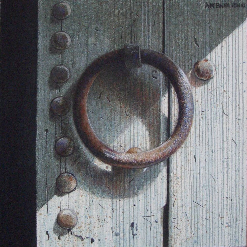
Wednesday, June 28, 2006

Publications; The watercolour "Skies and Clouds" Techniques

"River clouds", watercolour on paper

Through International Artist Magazine I have contributed to a number of publications produced by them over the past couple of years.

In The Watercolour "Skies and Clouds" Techniques of 23 International artists (phew!), I contributed to a chapter entitled - "Angus McEwan demonstrates how optical mixing can create richer colours". In this chapter I basically explain how I use watercolour, through a series of pure coloured layers rather than through colour mixing.

"Early morning - St Andrews", watercolour on paper
"Early morning - St Andrews" (above) is featured in the book. It shows me working step by step through the painting process towards the finished piece.
If you are interested in purchasing this or any other book by International artist you can find them here at;
The ISBN no for the "skies and clouds" book is as follows - (1-929834-35-7)
UK (£18.99)
US ($29.99)
I shall show you other publications later.

Monday, June 26, 2006

International Guild of Realism

" Holding back the pressure", Watercolour on Paper


I have mentioned on previous postings that I am an elected member of the Royal Scottish society of Painters in Watercolour (RSW). I am also an associate member of the International Guild of Realism (IGOR).

I am unashamedly a realist painter and believe that you should be true to yourself, with that in mind I have nailed my flag to this particular post with rivets.

The International guild of realism's mission is "to advance realism in Fine Art and to promote the careers of representational artists".

You can find the guild at this address;
http://www.realismguild.com/

Wednesday, June 21, 2006

Alastair Salvesen Award


Imperial Facade, watercolour on paper

It has been 10 years since I received this scholarship. I spent 3 months in China, and it proved to a seminal point in my art career in terms of subject matter, materials and methods used.

Turning point- Winning the Alastair Salvesen Award


When I decided to return to college in 1995 to study a post Graduate Certificate in Secondary Education, I had already been painting, and exhibiting, as well as working full time for eight years. It was during this period while at College, that I applied for a number of scholarships, one of which, I was fortunate enough to win, the Alastair Salvesen Travel scholarship.

I chose to visit China, and spent 3 months traveling and painting, almost as soon as I had graduated that June in 1996. I traveled from Beijing to Xian, Chongching to Nanjing, down the Yangtze River, and then on to Guilin and Yangshuo in the South of China.

As part of winning the scholarship, it was necessary for me to produce a number of paintings documenting my experiences. These were then to be exhibited in the Royal Scottish Academy, Edinburgh, on my return to Scotland. In the end I produced a total of 51 pieces.

I worked mainly from life and began to establish a rapport with watercolour, a medium I hadnt really explored properly up until that point. Since the material was light and convenient to carry, I found I could climb hills, produce a painting at the top, return to the hotel and finish the work from memory. This versatility gave me confidence to really start enjoying watercolour and I began to experiment with it.

This was the turning point where I established my interest and association with the medium of watercolour. The year before, I had been elected a member of the royal Scottish Society in Painters in Watercolours, but it was mainly with my acrylic work. I really didnt start using the medium in earnest until the China trip in 96.

For the past few years I have concentrated on watercolour and I have discovered and investigated a number of techniques which can describe a multitude of surfaces, (which I think are particularly unique). I owe it all to winning the Scholarship because it forced me to confront a medium I had considered at one point too difficult to even contemplate trying.


Escape, Oil on Board 1996

The reason for bringing up the Salvesen Award is to mention that my friend and colleague at Dundee College, David Martin is the most recent recipient and you can follow his travels through the middle East (brave man).

http://www.davemartist.typepad.com/

Tuesday, June 20, 2006

Marrakech

Welcome to Marrakech, Watercolour on paper

I am still working on the Morocco series for my exhibition in the Open Eye Gallery. I have a couple of months to work on my paintings and have completed about half the show .

Small paintings like this one still take me around a day to complete. Some of the larger pieces take months. What matters to me is the quality of the work and I would never knowingly let a piece out of the studio incomplete. The worst thing to me is to come across an older work which I know is not finished to the best of my ability at the time.

A finished work is one that no longer annoys me. When I do finish them I like to put them away and not look at them for quite some time. I know some artists like to live with their work for a while but not me. Once they are complete I move on mentally.

Monday, June 19, 2006

Made in Fife


The Alchemist's door, watercolour on paper

A mixed exhibition featuring the work of artists living or working in Fife opened on the 2nd of June, 2006 at the Jerdan Gallery, Crail. The exhibition continues until the 26th of June, 2006 and some of the work can be viewed at their website;

http://www.thejerdangallery.com/gallery/fife

I have 4 pieces in the show, two of which are seen here.

"The Ascent", watercolour on paper

Sunday, June 18, 2006

In the Store

"In the Stone of Venice", watercolour on Paper, 101 x 117cm

Sometimes through circumstance, the storeroom contains one or two gems which have only been viewed a couple of times. This piece, "In the Stones of Venice" was originally painted and shown in the Singer friedlander watercolour exhibition. When it returned I had it in the Queens Gallery for a couple of weeks then buried it in the store. I thought I would let you have a look as its feeling neglected (but alas not alone).

A wee note;

“In the Stones of Venice”, alludes to my feeling that the passing of time is conveyed by the surface history contained within an object, much in the way an old person is said to have their past written on their face.

In this painting I have hidden within the lower part of the wall, a map of Venice, which can be seen glinting from the surface like a vein of gold. The history of Venice is very much contained within her buildings and it was this, above all else, that impressed me the most about this unique city. So much so that I felt I needed to communicate this through my work.

The title also alludes to John Ruskin’s, “The stones of Venice”, where he spent long months working in Venice until he had reduced its beauties to “mouldings and mud”. My studies of Venice have reduced her to surface texture and ambiguity.

Friday, June 16, 2006

Saatchi Gallery

" The Water Guardian", watercolour on paper
Winner of the John Blockley prize, RI 2005


You can view some more of my work on the Saatchi Gallery website. A very informative and easy to use site, the virtual tour is definitely worth the visit.

http://www.saatchi-gallery.co.uk/yourgallery/artist/details.php?id=4443

Thursday, June 15, 2006

Thompsons Gallery Annual show


" Dragon slayer", watercolour on paper

Recently I have been informing everyone about where you can view and purchase my artwork in a "real gallery" setting rather than a virtual one. The obvious advantage is that seeing work in the flesh allows you to see subtleties, richness of texture, sense of size and the depth of the surface.
The beauty of the internet is that buyers from across the world can have the opportunity to view and purchase work that would previously be unseen except to a select few.
With that in mind, I will continue to show examples of my work on here and let you know where you can see or purchase them.
Thompsons Gallery, Annual show '06
( Aldeburgh, England)
3rd June-23rd June 2006

The Annual Exhibition is Thompson's largest and most important show, exhibiting works from all our major gallery artists and leading 20thC British Painters.
"Door of Ichthus", watercolour on paper

Wednesday, June 14, 2006

Artists Kew


This is just a wee note to say that the "Artists Kew" exhibition finishes on Sunday the 18th of June, 2006. If you still want to see the Exhibition times running out. Here is the website address to see the opening times/dates;

http://www.rbgkew.org.uk/artistskew/artists/McEwan_Angus.html